
[photo: Pantone]
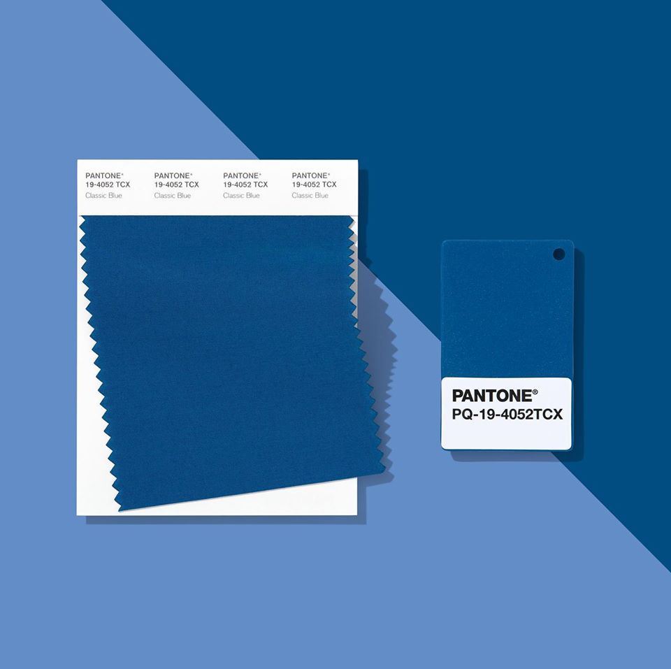
Others are claiming 2020’s Color of the Year pays homage to blue hues of Pantone’s first announced Color in 2000, Cerulean (15-4020). Although a softer blue than Classic Blue, both hues aim to evoke feelings of calmness while also emphasizing uncertainty and excitement the future holds. Leatrice Eiseman, Executive Director of the Pantone Color Institute, describes Classic Blue as “a solid and dependable blue hue we can always rely on. Imbued with a deep resonance, Classic Blue provides an anchoring foundation.” A glance at Classic Blue can conjure feelings of nostalgia, tranquility, and happiness.
Even if you don’t consider yourself a color enthusiast, Pantone’s Color of the Year selection is more influential than you think. The champion color shapes the year’s graphic design choices, runway looks, and even home decor. With so much weight on a color choice, the decision-making process is as conscious as you would expect it to be.
Early each year, experts at the Pantone Color Institute begin to research an array of trends such as film, art, travel, fashion, makeup, cars, and technology. The committee even examines the psychology behind colors and social situations around the world before making a decision. The decision process is continuous as members of the committee justify their color choices with concepts and photographs.
[photo: Pantone]
Are you looking to add soothing Classic Blue elements to your home? Purchase an area rug, lamp, or accent pillows. If you’re ready to integrate Classic Blue into your closet, start by treating yourself to a new scarf, tie, or blazer. Regardless of how you choose to express yourself with Pantone’s Color of the Year, be sure to have fun with it.
