Icon Vs Logo : Understanding the Difference
Sometimes there’s a bit of confusion about the difference between an icon, emblem, wordmark, and logo, and why it’s so ...
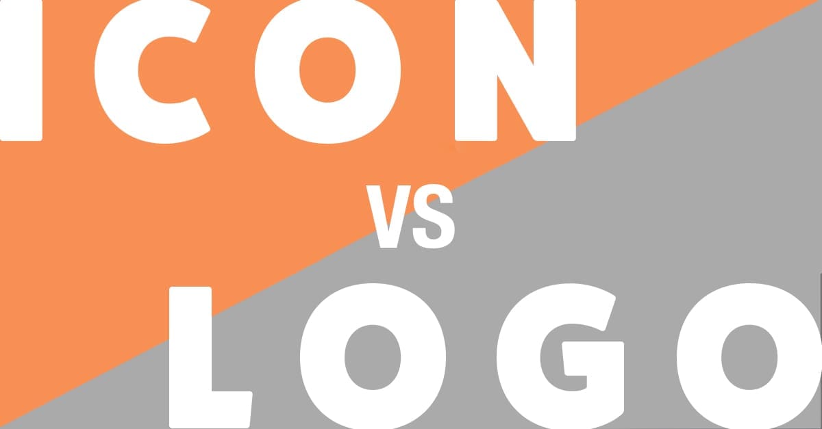
Sometimes there’s a bit of confusion about the difference between an icon, emblem, wordmark, and logo, and why it’s so ...
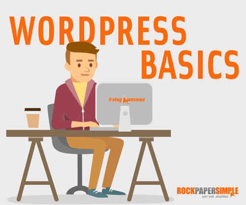
Welcome to Wordpress Basics with Rock Paper Simple! We thought you’d like a short rundown of what’s what on the backend of ...
With last minute shoppers flooding Amazon, Etsy, and other small businesses with holiday orders, we thought it might be appropriate to ...

The new Google Chrome Version 55 release marks another benchmark in the HTML5 migration. With this Version 55 update (besides Google’s ...
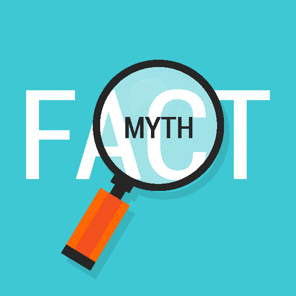
With the rapid growth of technological ability, there's a lot a misconception about what it takes to create and market a ...

Joshua was one of the mentors and speakers at the Media Magic Intensive this past Saturday and his topic was Making ...
In a world of Yelp reviews, Facebook advertising, and 140-character tweets, your online presence has really become your storefront. The online adaptation ...

Call to Actions can be a simple button placed after some text, or they can be a more elaborately designed button that ...

Chances are you have a Facebook account and you share content on there consistently. It’s probably why you’re reading this blog ...

Alright, in our last post we highlighted some key Analytics terms you should be familiar with, especially if you’re going to ...

Besides conquering galaxies and cooking your breakfast, did you know that one of the many benefits of your Rock Paper Simple ...

Recently we came across an article published by Advertising Age that we found extremely interesting because it mentioned an avenue of ...

*IMPORTANT NOTE:* if it doesn’t contain the AI or EPS file, you were not provided the original vector logo, which you ...

Oh yea... we made it! We've gotten through all 10 pitfalls and with plenty of time to spare... and here's #10! ...
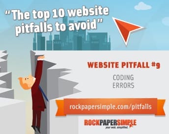
We run across improperly coded sites every single day and having that developer in me, I want to fix ALL of ...
"*" indicates required fields
1335 Gateway Drive, Suite 2007 Melbourne, Florida 32901
(In the Space Coast Creative Center)
Monday – Friday
9:00 AM – 5:00 PM

Copyright © Rock Paper Simple | All Rights Reserved | Website by Rock Paper Simple | Privacy Policy