Marketing Podcast – Joshua Adams on the Robert Plank Show
Our Head Honcho recently recorded a marketing Podcast! Joshua is the 195th Feature on the Robert Plank Show, and is now a ...

Our Head Honcho recently recorded a marketing Podcast! Joshua is the 195th Feature on the Robert Plank Show, and is now a ...

Joshua was one of the mentors and speakers at the Media Magic Intensive this past Saturday and his topic was Making ...
In a world of Yelp reviews, Facebook advertising, and 140-character tweets, your online presence has really become your storefront. The online adaptation ...

Call to Actions can be a simple button placed after some text, or they can be a more elaborately designed button that ...

Chances are you have a Facebook account and you share content on there consistently. It’s probably why you’re reading this blog ...

Your brand is one of your single most valuable business assets. It embodies everything that your company is and how your ...

The whole purpose behind any method of lead capture is to capture a prospect's information in some form or another. This could be a sales lead in which they are asking about your services, it could be their email address so that you can continue to market to them, a social follow so they can remain exposed to your marketing or any other form of lead or connection.

If you let it, your website can be the vehicle that grows your business and makes you more money. So stop treating your website like it is just a "website", a collection of pages and information hosted on some server halfway across the country that every once in a while you take a look at to update your rates, your office hours, your services or to post that random blog post that no one reads anyways. Start treating it like it is another vehicle that carries your message and your goals to even more people.

An unknown group has targeted websites using the Wordpress platform and are using advanced tools and techniques designed to use brute-force ...
What is W3C validation and why is it important? We in the "web world" tend to use scary words and acronyms ...
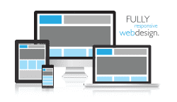
Responsive design is the term used to describe websites that respond to varying device and screen sizes. Sites developed in this ...
"*" indicates required fields
1335 Gateway Drive, Suite 2007 Melbourne, Florida 32901
(In the Space Coast Creative Center)
Monday – Friday
9:00 AM – 5:00 PM

Copyright © Rock Paper Simple | All Rights Reserved | Website by Rock Paper Simple | Privacy Policy