This month marks the end of life for Adobe Flash, a tool that web designers used to create animations long ago in the before times of the internet. In honor of web animation history, we will dive into current web animation tips that yield high frame rate animations for your marketing pages and websites.
Understand the Critical Rendering Path

The browser follows this timeline when rendering pages:
- Style: the browser calculates the styles to apply to objects on the page
- Layout: During this phase, the browser generates shapes, sizes, and positions. For example, elements with any Top/Right/Left/Bottom positions get their position on the page calculated during this phase of rendering.
- Paint: The browser starts to draw the pixels for each element into layers.
- Composite: This is the magic phase. Here is where you want your animations to occur. The browser draws the layers it painted during the previous steps.
Avoid CSS: Transitions on Left/Right/Top/Bottom Styles
The browser calculates element positions during the Layout phase, which means CSS transitions will cause the entire layout and all its children to be recalculated on the fly. This will result in choppy or laggy animations. Inspecting your animations using the performance debugging tool can reveal where your animations are experiencing issues.
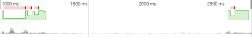
The green chart indicates the performance of the animation in frames per second, and we want that bar as consistently high as possible. Low green bars indicate frame rates below 60 frames per second. Red bars indicate performance issues or what we call “jank”.
In this example, an animation is being used in conjunction with the left: property. When the animation triggers, the browser is forced to recalculate positions in the Layout phase, resulting in high CPU load and poor animation performance. Instead, we want to run our animations in the Composite phase of the timeline, where animations can take advantage of GPU acceleration.
Take Advantage of GPU Acceleration with CSS: Transforms Instead of CSS: Transitions
The Transform properties are run in the Composite phase. In effect, we are telling the browser that the layers are painted and will be ready as soon as the animation begins. There will be fewer hiccups in the animation because the position calculations have already been performed (remember, positions are calculated in the performance-heavy Layout phase). Not having to calculate new positions means the Composite phase can smoothly animate the layers.
Here is the same animation, but using Transforms instead of Transitions: 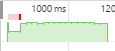
The overall performance is much improved, but there are still a few slower frames at the start of the animation indicated in red. This can be improved even further by taking advantage of translateZ() or translate3d() properties, which then forces the GPU to render the animation and not the CPU. This promotes the elements to their own layer, and the browser doesn’t have to perform the more expensive Layout or Paint phases over again. The GPU can simply animate the composite layers for buttery smooth animations.
Be Aware of Your Layers
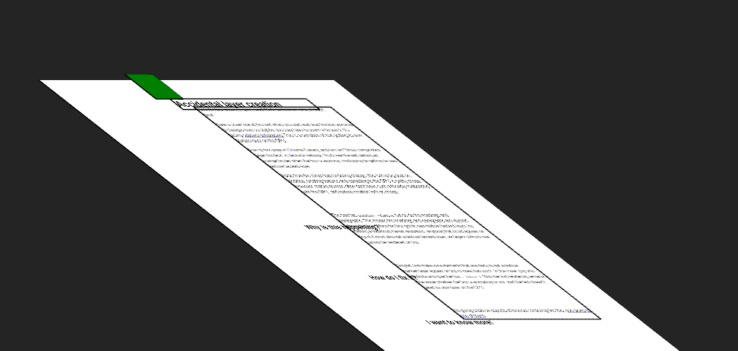
In this image, we can see all the text layers have been promoted to the same layer as the animation. As we learned before, the more children being affected by the animation, the greater the likelihood that our animation will suffer from low performance as the browser. We want only the elements to be animated on their own layer.

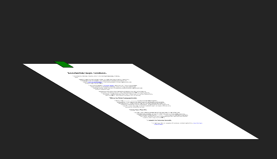
In this image, we turned on a browser feature that shows the elements being repainted in the Paint phase of the rendering timeline. Only the green square is animating, but all the nearby text has been promoted to the same layer as the animation.
Therefore, be aware of your relatively and absolutely positioned elements to avoid multiple elements being promoted to the animation layer. In this particular example, we can set the z-index: of the green square and essentially promote it to its own layer.
Now, we can see just the green square elevated above the text layer, and subsequently, the animation is smoother. Additionally, making sure you are observant of your layers will help you avoid situations where the text becomes blurry due to losing its sub-pixel anti-aliasing.
Here at Rock Paper Simple, we stay on top of the latest web design trends to make sure your business is properly represented and looking top-notch. This means getting technical and diving into the small things, like animations!
