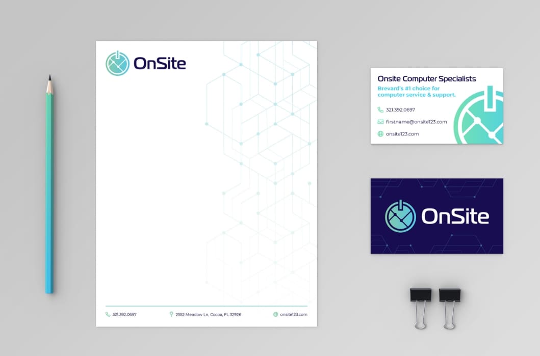
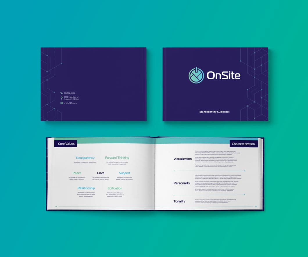
As a growing, Brevard-based, Managed IT Services Provider, this client came to Rock Paper Simple with a burning rebranding question, “How do we portray ourselves as a people-serving business that also handles technology?” The content for their brand book was formulated and created through three collaborative branding sessions (in which we explored and expunged the true essence of their awesome brand message) and then we topped it all off with a custom logo redesign.

-Danielle Hurley, Graphic Designer, Rock Paper Simple
Deliverables for this full-service IT company included digital and printed versions of their new Brand Book containing brand identity such as vision, mission, promise, characterization, visual identity, brand collateral, proper logo usage guidelines, core values, and value statements.
Additionally, we generated a shorter, catchier brand name for OnSite (formerly OnSite Computer Specialists) together. Working together, we drew out a tagline that was significantly more representative of their brand’s culture, offerings, and values, “Stewarding Technology. Serving People.”
OnSite Branding


