Call to Actions can be a simple button placed after some text, or they can be a more elaborately designed button that stands alone. You have them sprinkled into social media posts and they’ve been written into your content, but are your CTAs the best they can be? If you aren’t seeing a whole lot of conversion from your current strategies, take a look at these Call to Action examples that we think have great technique.
The Balancing Act:
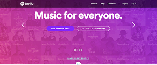
Check out Spotify’s homepage. They have two Call to Action Buttons because they’re targeting two different types of listener, and they’re a great example of why simple often prevails over flashy, especially when you have more than one CTA. While the pink and purple colors of their site definitely catch our attention first (what happened to the green?!), the contrasting and bold white text is really what dominates our focus. Their design works because they kept text to a minimum, they showcase their product through a subtle background of playlist cover art, and their CTAs are highly visible to both types of listeners which maximizes their opportunity for new sign-ups. Spotify made a great decision to have their Call to Actions side by side with only a slight difference between them; the darker hue that backs “Get Spotify Free” almost blends in at first glance, bringing our attention first to the button they’d prefer us to choose- “Get Spotify Premium.”
Being Socially Savvy:
Implementing good strategy by utilizing Ad opportunities on any social media platform will help boost your business. With the right verbiage, imagery, and intent, you can connect with your target audience and start to build a customer relationship that leads to conversion. Currently there are now many options to choose from across a variety of platforms, but the most popular option has become the Ads that appear integrated into user “Home” feeds. Advertising on Social Media lets you briefly showcase the highlights of your business or brand identity, and by using amazing graphics, offering sneak peaks, and bringing quality content to followers, you can lead potential clients to your website (and convert ‘em!). So if your marketing goals are to increase brand awareness, drive traffic to your site, or expand target reach and grow your customer base, then social media CTAs are for you. Here’s a fine example of a CTA on a feed-style Ad from NatureBox on Facebook:

Surprising Humor:
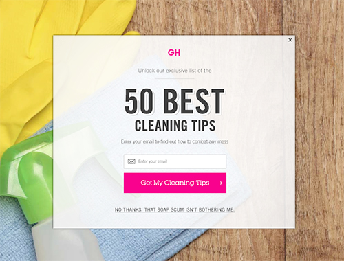
This pop-up from Good Housekeeping abruptly stops us from reading whatever article we clicked on by taking up the entire browser window, but the bright colors and fun language keep us from getting too frustrated. Through clever verbiage, simple design, and bright colors, this refreshing pop-up effectively gains email subscriptions because it has us admitting that we could use a little help keeping things clean around here. Even if you aren’t interested in giving GH your email address now, the lighthearted jest of the exit link appeals to clean freaks and reluctant scrubbers alike, and encourages them to click through the site and read other articles- and thus gaining followers.
Embracing Window Shoppers:
Prezi has a very minimal homepage with a lot of whitespace surrounding their text and Call to Actions, which draws a visitor’s attention to the video banner and colored CTA buttons. Similar to Spotify, Prezi balances two main CTAs side by side (for individuals vs. business), however underneath those there’s a CTA that draws even more attention. Prezi encourages visitors to “See the Science,” embracing the fact that most people want evidence of success before they invest in something. The iconography and colors that are used draws our eyes down the page, and they pave the way for even more visual aids on the linked page. This CTA clearly illustrates that Prezi has research relating to the effectiveness of their product and that they want to share it with us. This refreshing Call to Action method encourages people to make an informed decision by learning something before they sign up, and “See the Science” is definitely a unique take on the traditional About page.
The Doorstop:
The final plea to users, an exit CTA is a pop-up window that most websites set to appear around the average exit time of that page. These CTAs traditionally offer a discount or incentive, and then provide two options- stay or go. They can sometimes be seen as a nuisance, but if designed correctly, doorstops can be a very effective method for keeping users on-site, capturing leads, and getting visitors to convert to buyers. Take a look at this example from Copyhackers. The colors are positive, the layout is clean, and the language is relaxed. Instead of expressing urgency, the tone of this exit CTA says “Hey, your stuff is probably already great but before you go, here’s an opportunity to be even better at what you do…do you want this resource?” It uses buzzwords like share, success, and steps, which leads us into thinking, “Hmm, maybe I want to at least skim through this ebook after all.”
Call to Actions are a super important part of marketing strategy, and hopefully you’ve already incorporated some that are working for you. We just wanted to give you guys a bit of reference for CTA techniques that are working really well right now for these businesses, to help you get the creative juices following for your next site upgrade or campaign push. It’s always a good idea to collect examples of website features, CTAs, or other digital marketing aspects that inspire you to make changes for your business. This way we can help you make those adjustments and strategize with you on how to meet your new goals!


