 Ever enter a busy intersection where someone was directing traffic? Ever wonder what it would be like if the traffic cop decided to quit and walk away? No one would know where to go and it would be a disaster!
Ever looked for a store or office location and couldn’t find it because it wasn’t well marked? Maybe you couldn’t find the entrance… or, worse, the exit!?
Ever walked into an office and the lobby was empty with no one to tell you where to go? Then you have to decide if you should just sit down or go exploring!
This is what happens to many many websites. People arrive in the front lobby (the home page) and wander around a little. They aren’t sure where to go next and will really just tend to wander around until (you hope) they actually get to a place on the website where they find what they were looking for and turn into a sale or conversion… or, and the more likely event, they get lost, confused and frustrated and leave your website when that dream product they have been looking for all their lives (the one you sell) was actually just two clicks away!
How your visitor navigates your website should never be left to chance. Start by identifying the most important pages on your website and listing them in order.
Decide which ones will turn into leads, sales or conversions for you. Now it’s time to drive traffic to those pages!
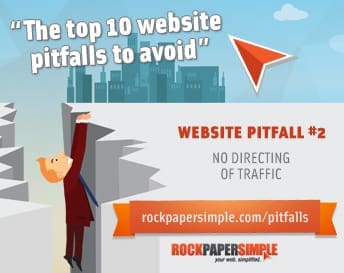
When visitors come to your website, there should be several call to actions, an obvious communication to the visitor to take a certain action. A call to action (or CTA for short) is different depending on the application, but really is all about getting that user to take an action. For now, we are talking about directing traffic, later we will talk about CTA’s in regards to getting conversions, but first we much drive traffic to where we want them.
Once you know your most important pages, be sure your home page has 3-5 call to actions (most of the time these are buttons) to drive visitors into the most important pages of your site.
Never rely on your menu navigation for visitors to use to get to those pages… because it leaves too much to chance, especially if you have lots of pages.
Next, make sure that no page is a dead end. It either has a conversion method on it or has a call to action that takes the visitor to the next step in the process. Sometimes you need a few pages in between to get the visitor to where you want them, but remember that you only have their attention for so long.
When people land on your website, they need to know that you have what they are looking for… and they need to know, fast! If you don’t provide an easy and fast way to help them find what they are looking for, they will leave and you will lose the prospect.
There is coaching team that are colleagues and dear friends of mine and when they first came by to visit our web design office here in Melbourne, FL… and when they came upstairs, one of the first things they said was “Wow! You even have a call to action in your office!” referring to a banner at the entrance that says “come see us upstairs”, leaving no doubt where a visitor will find us.
Never leave your visitor with doubt regarding where to go next on your website.
Download our FREE eBook that includes the other 9 reasons!
[freebie id=”1423″]